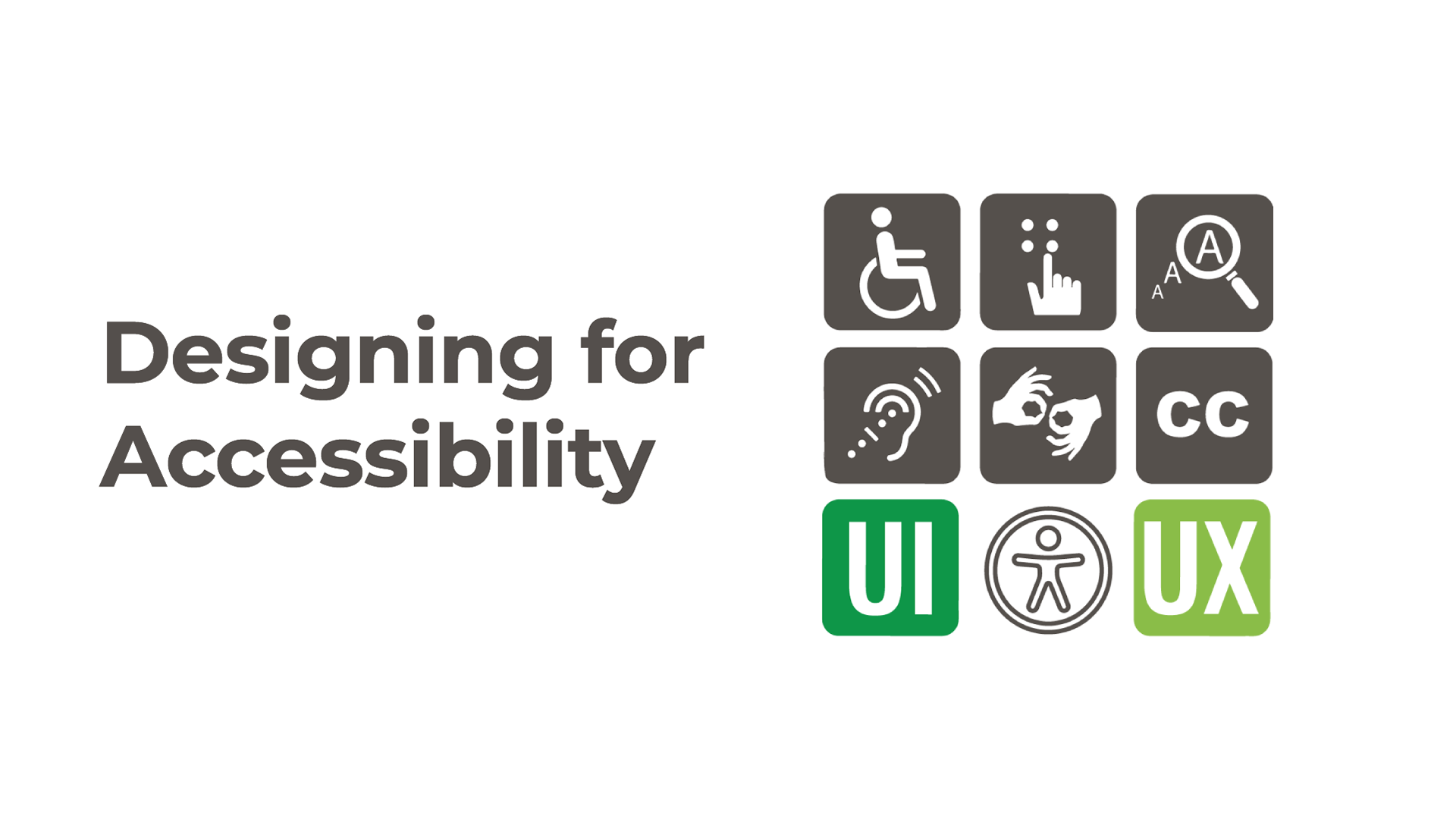
What Is Accessible Design and Why It Matters
By Muhammad Sharjeel | Published on Sun Apr 13 2025
Defining Accessible Design
Accessible design refers to the practice of building digital interfaces that everyone can use — regardless of ability, device, or context. It includes everything from making sure your site works well with screen readers to ensuring users can navigate via keyboard or understand visuals with limited color perception.
It’s not just about compliance — it’s about inclusivity. A well-designed app should never leave someone behind because of a visual, auditory, cognitive, or motor limitation.
Why Accessibility Matters
According to the World Health Organization, over 1 billion people — about 15% of the global population — live with some form of disability. And yet, a surprising number of websites and applications still exclude these users, either unintentionally or through neglect of basic accessibility practices.
Designing with accessibility in mind benefits everyone. For example:
- Captions help not just the deaf, but users in noisy environments.
- High-contrast text benefits users with vision loss — and those using devices outdoors.
- Keyboard navigation isn’t just for accessibility — it enhances productivity for power users.
Core Principles of Accessible UI Design
Here are some of the most important foundations of an accessible interface:
Semantic HTML
Always use the right element for the job. A button should be a <button>, not a styled <div>. Use headings to create a content hierarchy (<h1> - <h6>), use lists appropriately, and label form inputs with <label> tags.
Keyboard Accessibility
All interactive elements — buttons, forms, links, menus — should be reachable and operable using only the keyboard. Use tabIndex responsibly and ensure that focus states are visible.
Screen Reader Support
Use ARIA attributes wisely to add context where semantic HTML isn’t enough. For example:
<button aria-label="Close modal">×</button>Screen readers translate visual cues into audio for blind users — but only if the code provides enough semantic detail.
Color Contrast
Text should have enough contrast against the background to remain legible for people with low vision or color blindness. Tools like WebAIM Contrast Checker help you meet the WCAG (Web Content Accessibility Guidelines) minimum of a 4.5:1 contrast ratio for normal text.
Alt Text for Images
Decorative images should be marked with empty alt="" attributes. Informative images should describe what’s essential. For example:
<img src="team-photo.jpg" alt="Our design team collaborating on wireframes" />Tips for Making Your UI More Accessible
- Use semantic HTML as the first line of accessibility support.
- Test with screen readers like VoiceOver (macOS) or NVDA (Windows).
- Ensure keyboard-only navigation works throughout your site or app.
- Follow WCAG guidelines — especially WCAG 2.1 Level AA, which most standards use as a baseline.
- Label your inputs clearly, and use descriptive
aria-labeloraria-labelledbywhere necessary. - Don’t rely solely on color to convey meaning. Add text or icons to clarify status or messages.
Accessibility Is Not a Feature — It's a Foundation
Accessibility is not something to be tacked on at the end of a project. It needs to be part of your development and design process from the beginning. The more you embed these principles early on, the easier they are to maintain — and the more welcoming your product becomes to a broader audience.
Inaccessible interfaces aren’t just bad design — they’re broken experiences for the people who need them most.
Resources to Learn More
Start small — fix one accessibility issue at a time. Every improvement makes your app better, more inclusive, and more impactful.